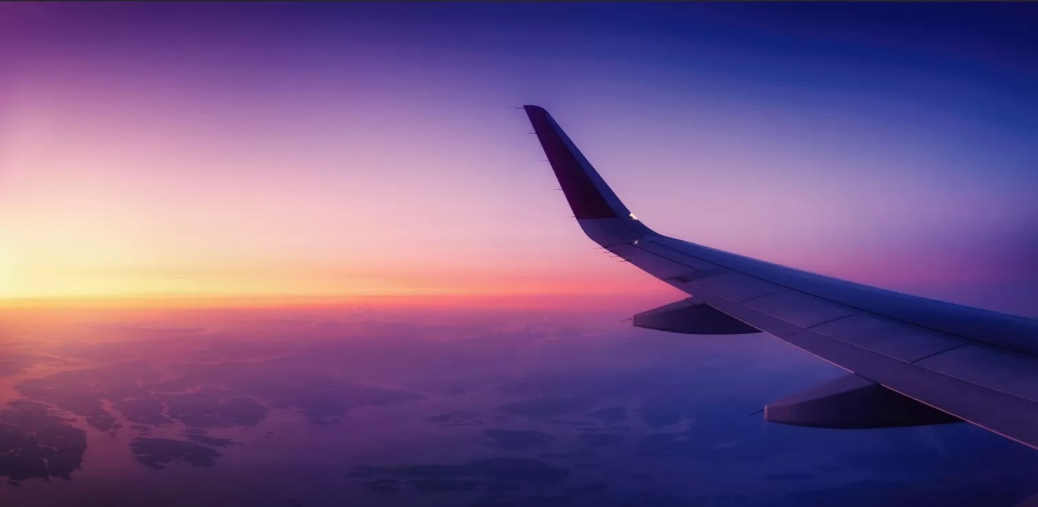
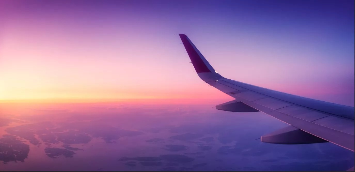
Have you ever taken a photo of a beautiful, clear blue sky on a sunny day – only to wrestle with tonal banding in your image later? The same thing can happen with any brightly lit smooth background, including .
Before you hit delete on those images, here are a few tips to help fix it, as well as to avoid it in the future.
What is Color Banding?
Often subtle, but occasionally very noticeable; color banding is the appearance of rings or layers of separate colors where a smooth transition is expected.

Before we dive into true color banding in images, sometimes banding is just an illusion created by display settings or incompatibility. File preview and thumbnail images of large uncompressed files can often show banding where the PSD/TIFF file itself does not. Open the actual file in an editor like Photoshop or Lightroom and zoom in to view the banding at 100% scale. Verify whether the separation between each band appears to move or change as you zoom in and out. If it moves, changes or disappears, the problem is just a display issue. If the banding is still visible and doesn’t change as you zoom in, it’s in the image.
Technically speaking, banding doesn’t have as much to do with specific hues so much as it does with tones. When banding does occur, it usually happens because there aren’t enough increments of light to dark (tone) available to work with in the file.
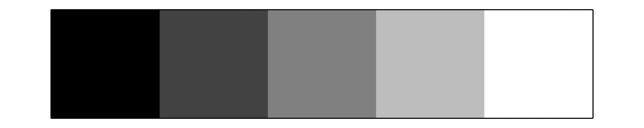
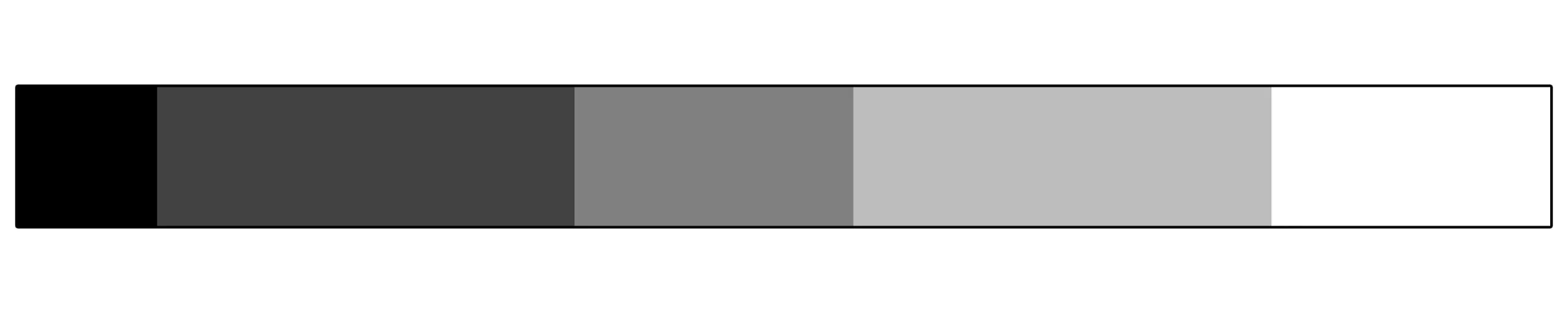
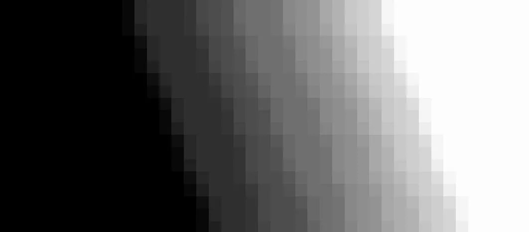
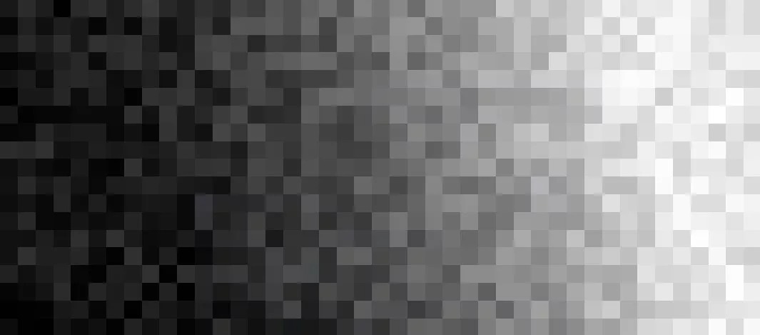
Let’s imagine an example where we have 5 crayons: white, black, and three shades of gray – and 5 empty squares in a row to color in. Using just one crayon to fill in each square, the transition from light to dark along the row would appear to be relatively even and uninterrupted. However; if we needed to fill in a row of 11 squares; we would have to use at least one crayon more than once. The transition would no longer appear to be as even or gradual. The larger the difference between the number of squares and the number of available tones, the more pronounced banding becomes. In order to combat banding, we need to add more tones to the pile of crayons.
What is Bit Depth?
Bit depth is the image attribute that controls how many tonal values are available to work within an image. The “bit” part of the term refers to how much information can be stored for each of the three RGB color channels. The more bits per channel, the more detailed information about tone and color data can be stored to express the value of each pixel. While bit depth also impacts the range of hues that are available in an image, noticeable banding can happen regardless of hue or color saturation.
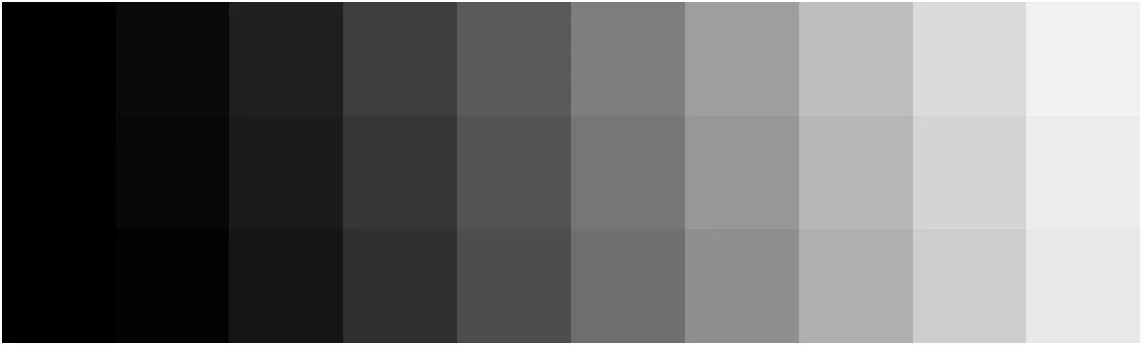
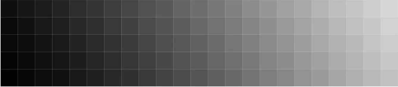
Here’s a general illustration of how the range of tones vary within 8-bit, 16-bit and 32-bit image modes. The greater the bit depth, the more tones available to work with in the image.

When is Banding Most Noticeable?
Banding is generally most noticeable in areas of an image when there are strong changes from bright to dark and in areas without patterns, details or multiple colors. In high resolution images, the number of pixels spanning across open areas of the image can outnumber the total available tonal values available, causing some values to be repeated – which produces the appearance of banding. For this reason, banding is often less noticeable smaller images, versus larger images. The problem occurs when either we don’t start out with enough tones and colors, or when we mistakenly throw color away when editing or exporting an image.
In the digital world, increasing the tonal range is done by increasing the file’s bit depth. This allows more degrees of light and dark to be associated with each channel (Red, Blue, Green) in the image.
Similarly, color space can also be increased to add to the range of hues in the image’s available color palette. While banding can happen across gradients of color with the same brightness/tonal level, it is much less noticeable. Most cameras allow us to capture images using either the sRGB color space or the AdobeRGB color space. The sRGB color space has the narrower range of colors of the two. Just like a box of crayons, we want to color and tone our images using as many available RGB values as we can.
Factors that set the stage for noticeable banding:
Big differences in brightness across gradients.
Strong adjustments in contrast or saturation made to high resolution files working in 8-bit image mode and/or sRGB color space.
A reduction in the range of tonal values available as compared to when the file was created or last saved. (Example; viewing or opening a 16 bit AdobeRGB image in 8-bit SRGB)
Exporting unconverted images to a smaller range of tones and colors.
How to Avoid Banding
Set your camera’s color space to AdobeRGB.
Shoot in RAW file format (vs. JPEG), and AdobeRGB mode in order to capture the most color information possible.
Light solid backgrounds evenly.
Frame open sky photos against an evenly lit section of sky.
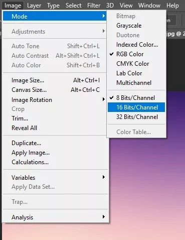
In Photoshop, Lightroom and other editing applications; set the default image mode to 16 bit in Lightroom/Photoshop.
Enable dithering, on new document default settings and in gradient tools.
Dithering is where two tones/colors are inter-dispersed with each other to create the illusion of additional colors or smoother gradients.
In the image file, BEFORE making any edits or layer adjustments:
Change the Image Mode to 16 bits per channel.
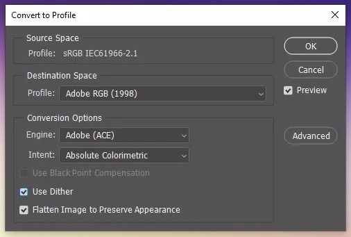
Convert the color space for the image to AdobeRGB (if necessary).
Make all edits and adjustments while the file is in a PSD or TIFF file format.
If you plan to save your file for digital display (computers, phones, etc.) versus for print; complete all changes BEFORE:
flattening the layers,
converting the image to 8-bit mode and sRGB color space, and then
reducing the image size/resolution
Then go ahead and save the file as a JPEG or other compressed format.
Doing all of these things in Photoshop before exporting the file will help ensure a much smoother conversion of colors and avoid the occurance of banding during file export because Photoshop will do the color and tone conversions in stages vs. everything at once.
How to Fix Banding
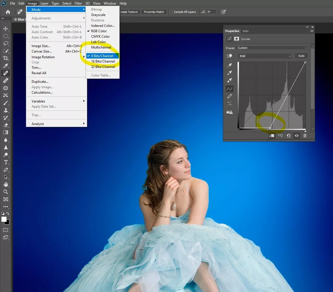
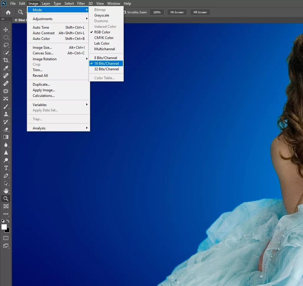
Change the Image Mode to 16 bits per channel: Image\Mode\16 bits\Channel.
Convert the color space for the image to AdobeRGB.
Add Blur, Noise or Texture.
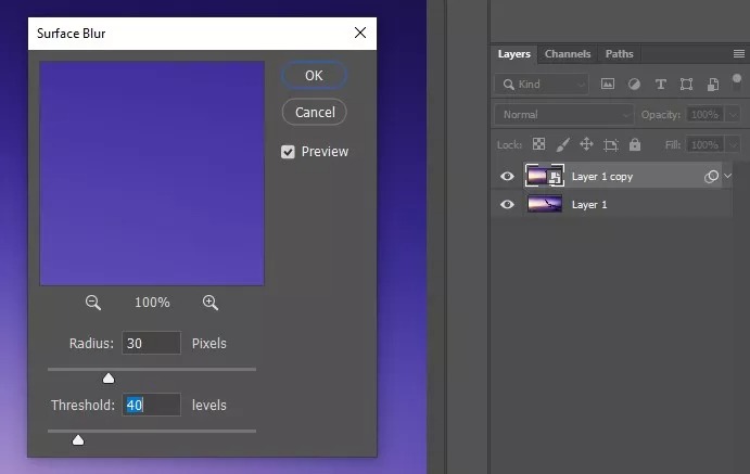
A) Blur method (effective on strong banding)
Copy the background layer: Cmd/Ctrl – J.
Make the layer copy into a Smart Object (so you can modify as desired): Filter \ convert for smart filter.
Add a surface blur: Filter \ blur \ surface blur (won’t affect detailed areas as strongly as other blur modes.)
Zoom into an area where banding is visible in the preview window.
Adjust the radius and threshold values to the lowest values that resolve the banding. Threshold will have the most impact.
Add a black layer mask: Layer \ Layer Mask \ Hide All.
Select the Brush tool. [B] Select a soft brush and set the opacity to 50%.
Paint with white on the mask over the areas most affected by banding.
B) Noise method (effective on mild banding)
Work in 16 bit mode: Image \ Mode \ 16 bits/Channel.
Create a new 50% gray fill layer: Layer \ New \ Layer… then Edit \ Fill… in “contents” field, select 50% gray.
Change the layer blend mode to “Soft Light”.
Add noise: Noise \ add noise.
Choose Uniform, and tic the box for “Monochromatic”.
Adjust the level until you see improvement.
Add a black layer mask: Layer \ Layer Mask \ Hide All.
Select the Brush tool. [B] Select a soft brush and set the opacity to 50%.
Paint with white on the mask over the areas affected by banding.
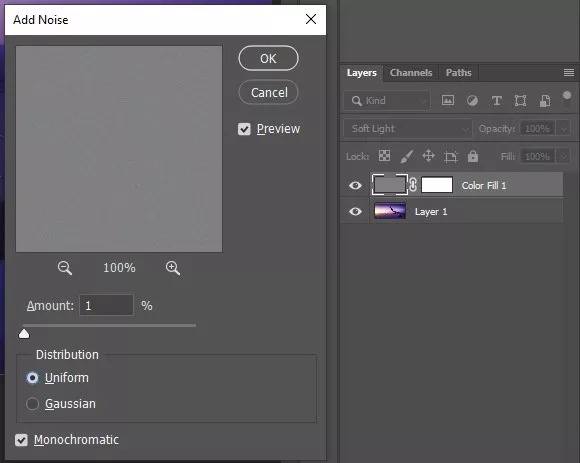
It can also sometimes be helpful to reduce the image contrast (or saturation).
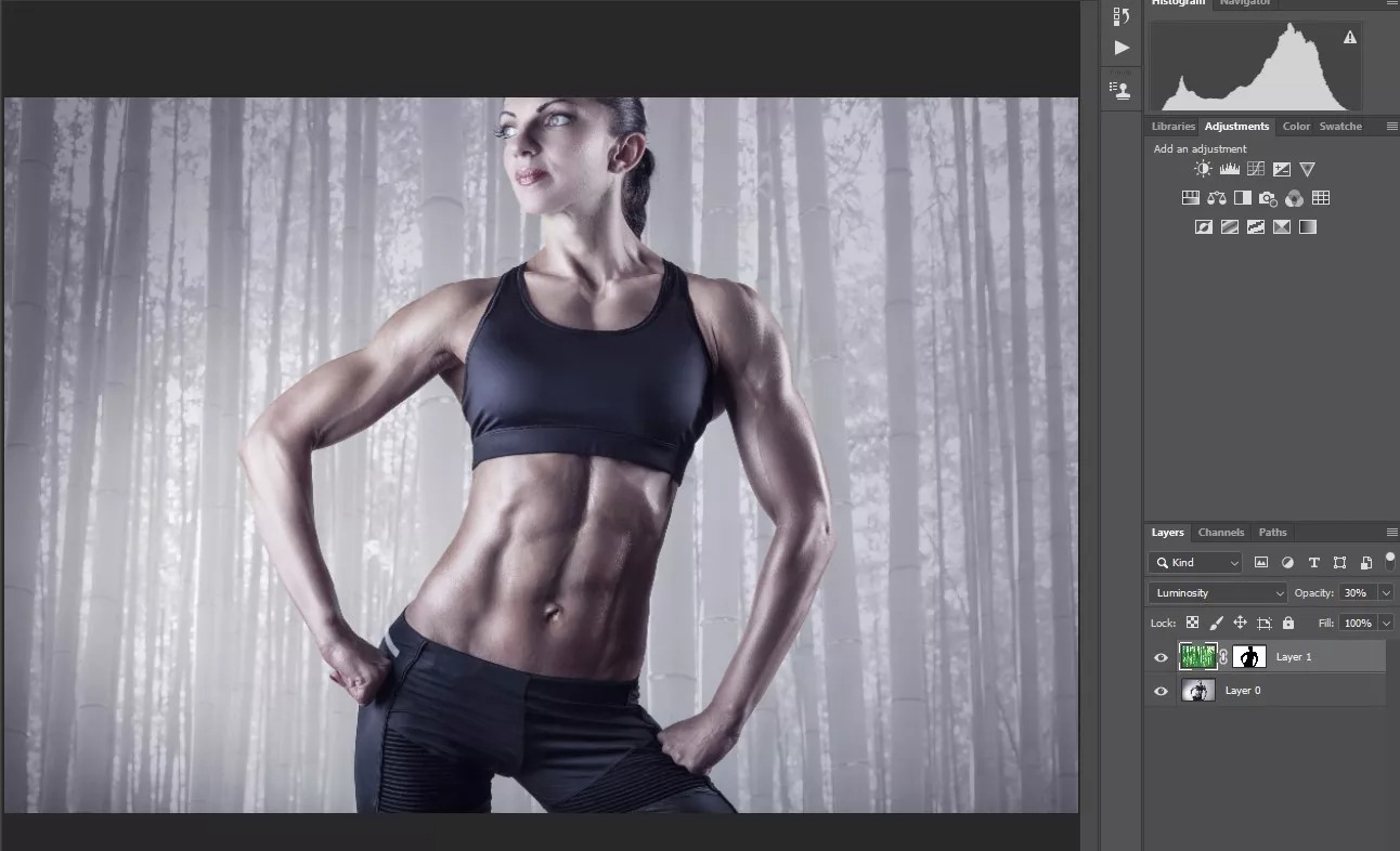
C) Texture method

Open a texture or pattern image that is a similar size to your image.
Copy the background layer (Cmd/Ctrl-J).
Using the Move tool (V), hold shift, then click and drag the layer copy onto your image.
Change the layer opacity to 50% (to see the image below).
Transform the layer’s scale to fit your image as desired: Cmd/Ctrl-T.
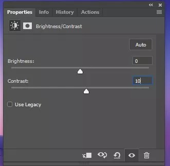
Change the layer blend mode to Luminosity, Soft light, Multiply, for desired effect and readjust the opacity.
Click the eye icon to temporarily hide the texture layer.
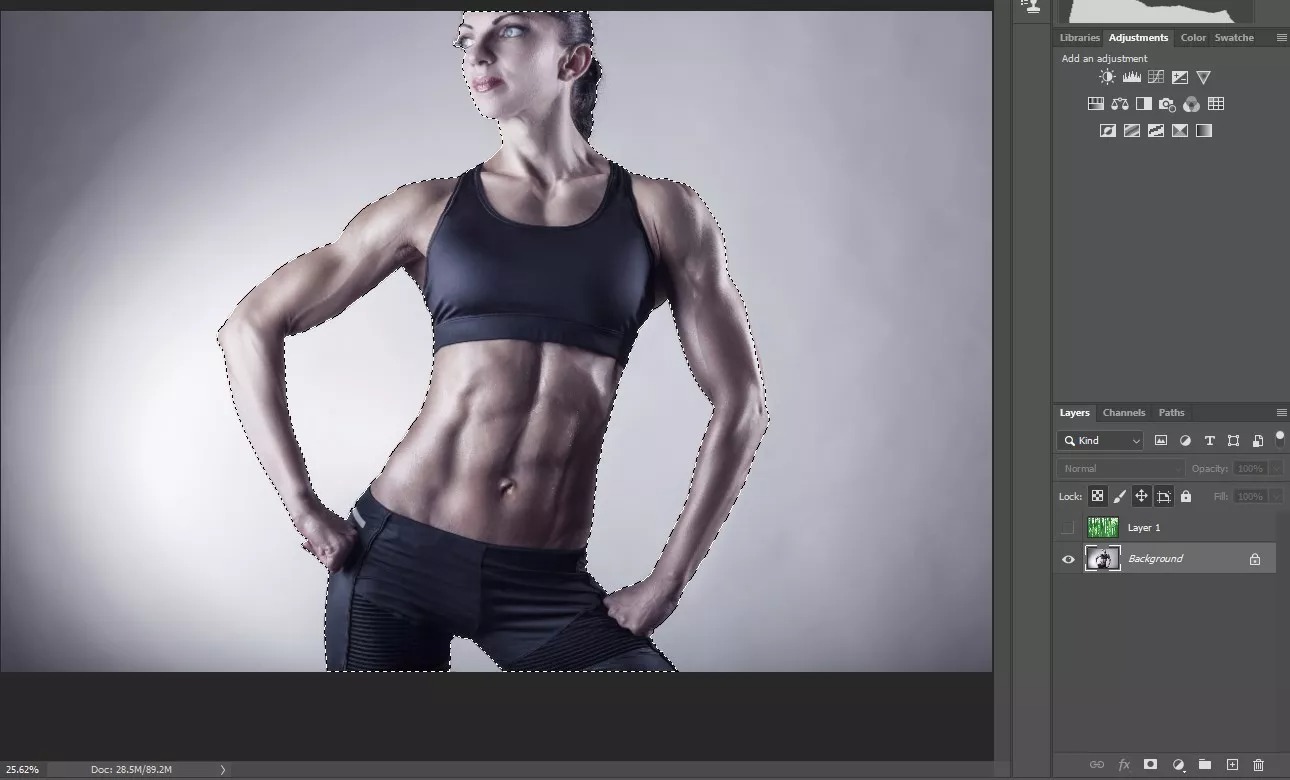
Click on the original image layer and select the subject: Select \ Subject
With the subject selected, unhide and click on the texture layer.
Add a black layer mask: Layer \ Layer Mask \ Hide All
Alternately, select the Brush tool. [B] Select a soft brush and set the opacity to 50%.
Paint with white on the mask over any areas where you want the texture to appear and black where you want it not to appear.