


Enhance Your Portraits by Complementing Your Subject with the Right Shade of Gray Seamless Paper
are classic and timeless. Great for both formal or casual looks, they allow your subject to be the focus of attention in the image. And gray is just gray, right?
Well… not exactly.
What is Color Temperature and Why Is It Important?
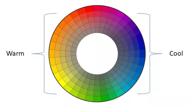
Colors can be categorized in a few different ways. Very often in photography, we think of colors in terms of relative “temperature” around the circumference of the color wheel. Where there is proportionately more blue we think of a color as being “cool”, and where there is more yellow (opposite of blue) we think of the color as being “warm”.
Contrasting, also called “complementary”, color temperatures accentuate each other. Blue looks bolder right next to Yellow and Red really pops against Green.
Analogous colors, those close to each other on the color wheel, create a sense of harmony and cohesiveness.
When there is no single predominant hue we get a true neutral – white, gray or black. Neither warm nor cool, true neutrals have no temperature or “color cast”.
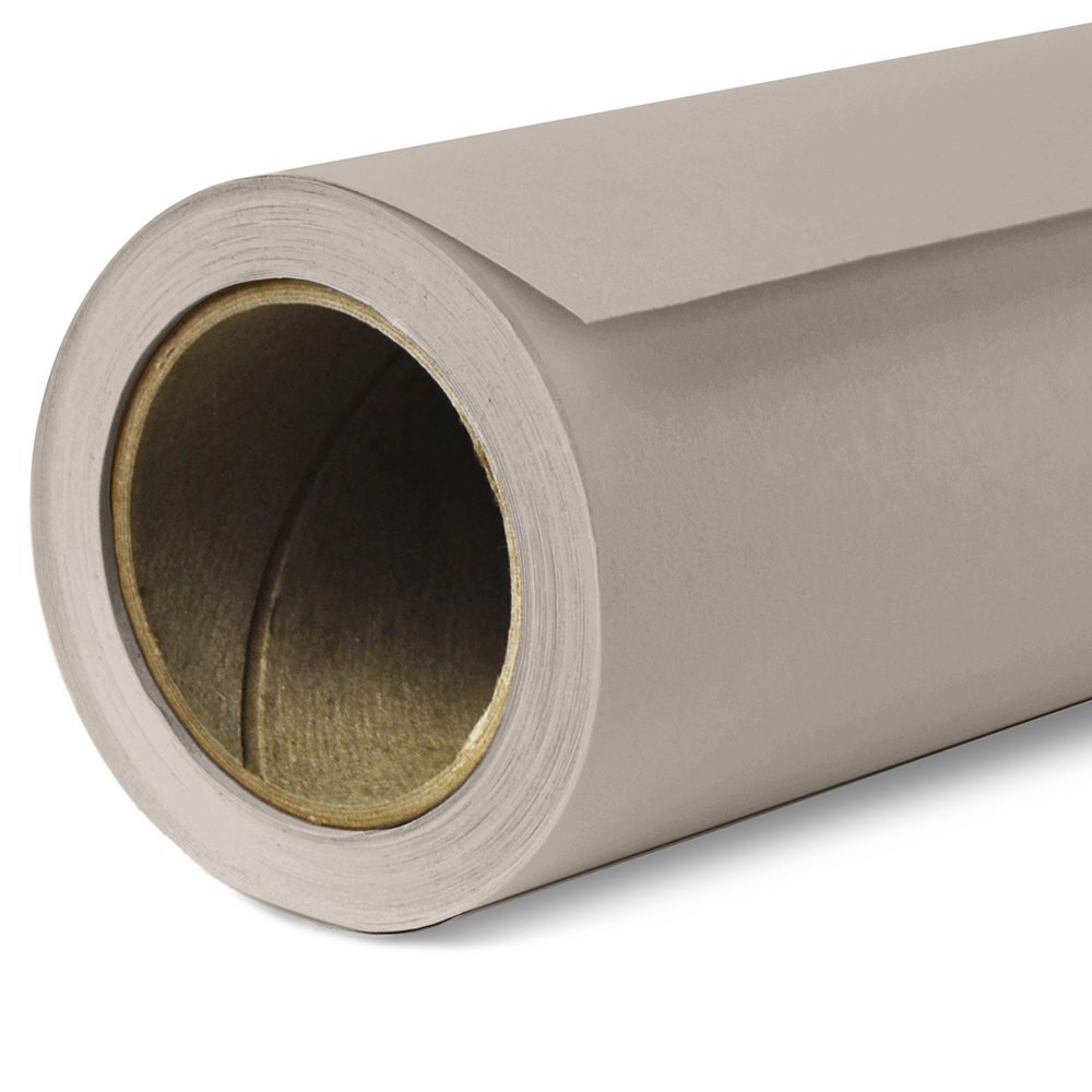
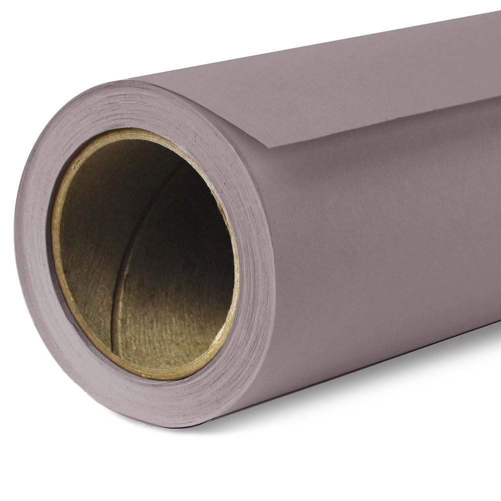
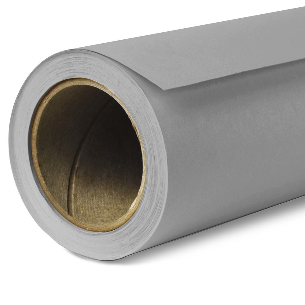
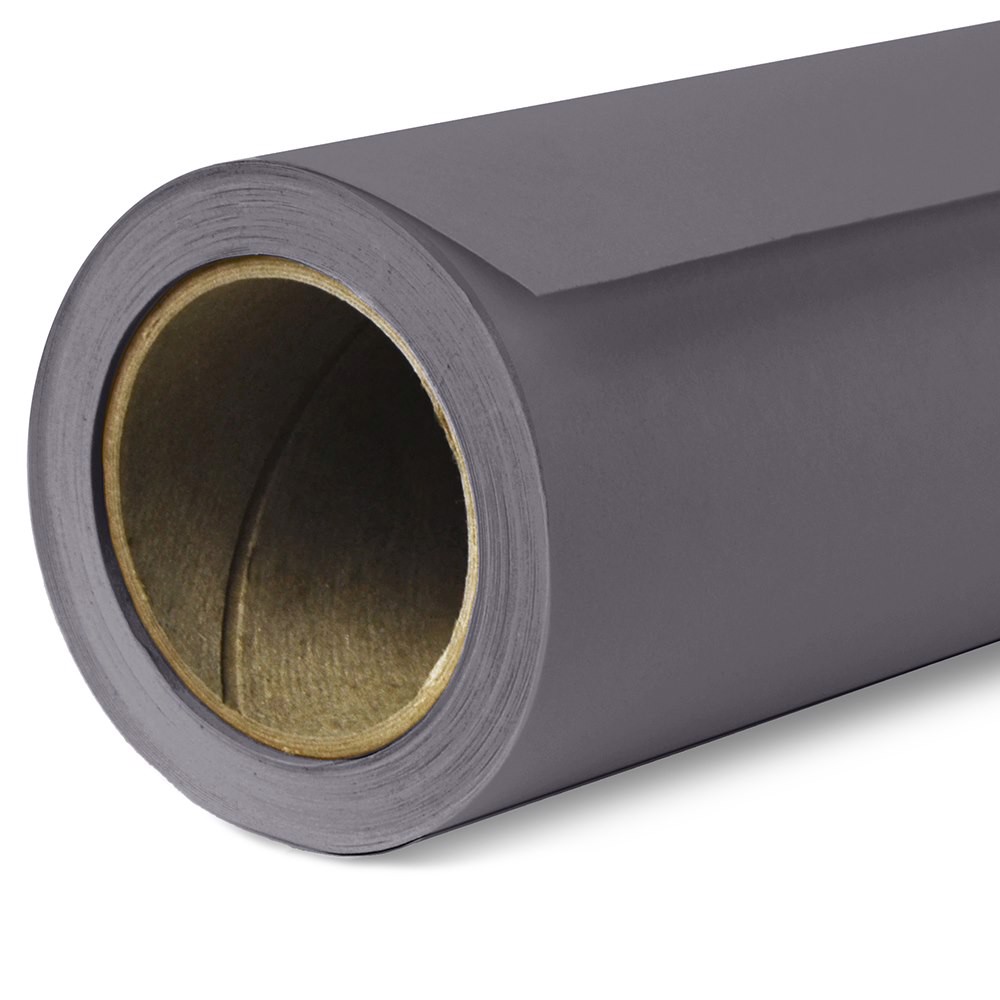
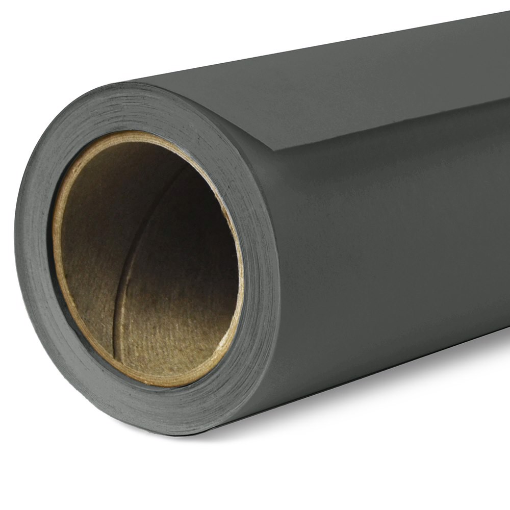
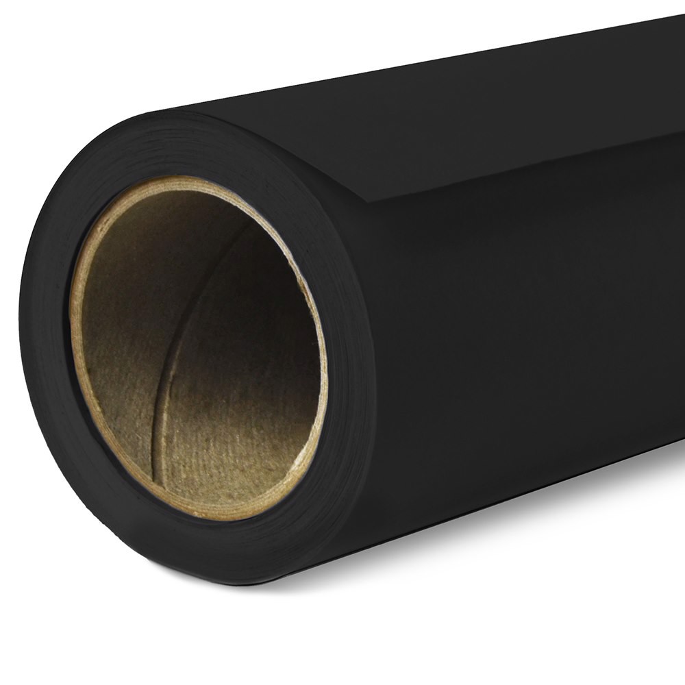
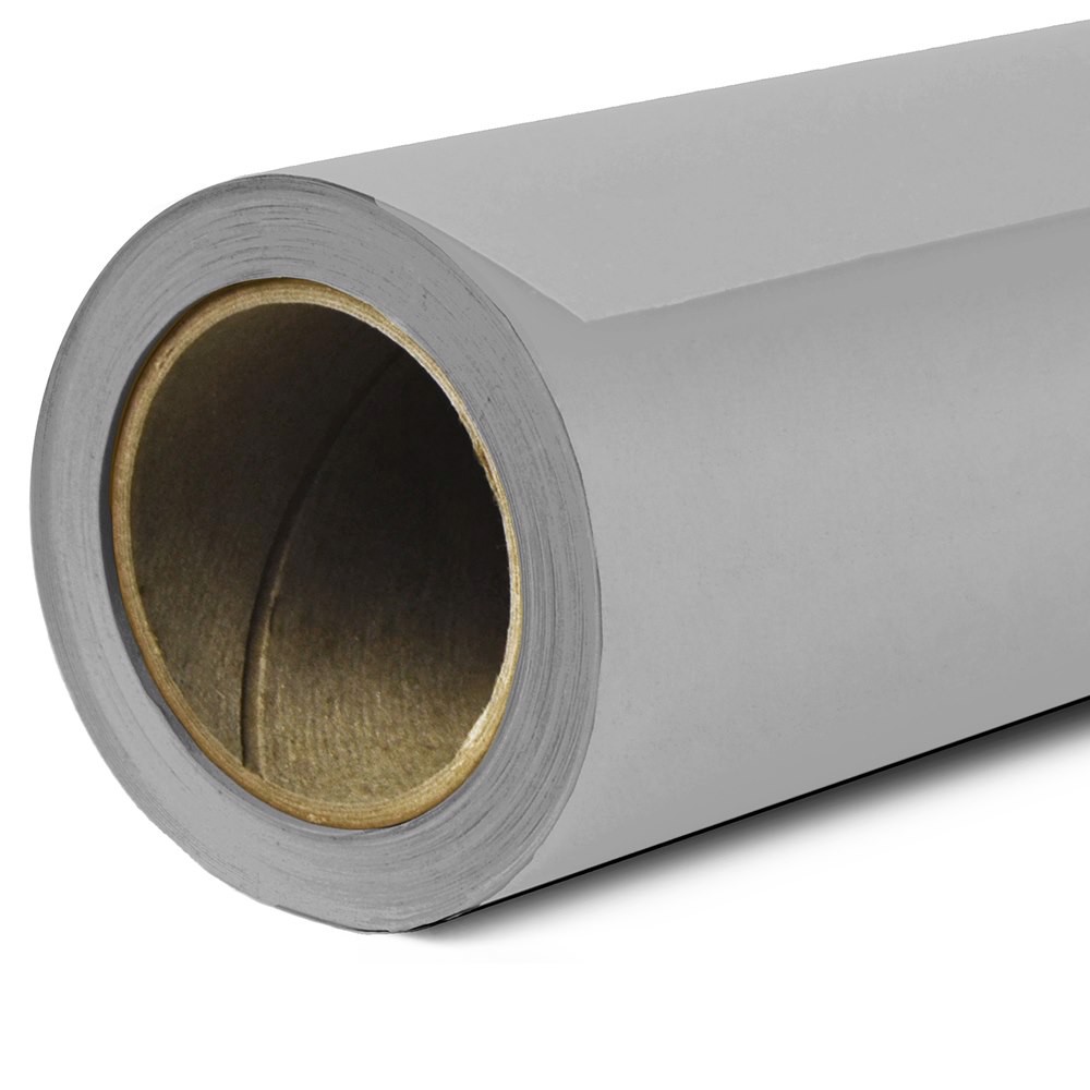
Exploring Savage’s 9 Shades of Gray Seamless Paper
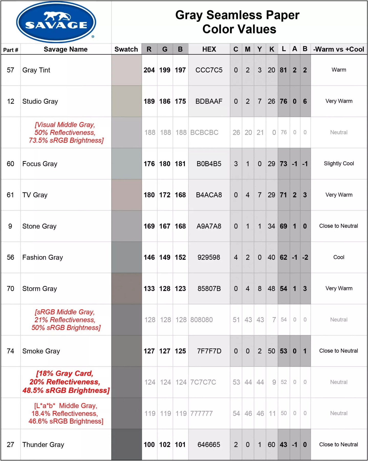
In the chart below, Savage neutral and choices are organized top to bottom by tonal value (brightness). Be sure to view this and other color examples on a color calibrated screen.
Notice that there are several gray tones that are close to neutral in temperature, however none are exactly technical neutral gray. Looking for something close to an 18% gray card? Try .
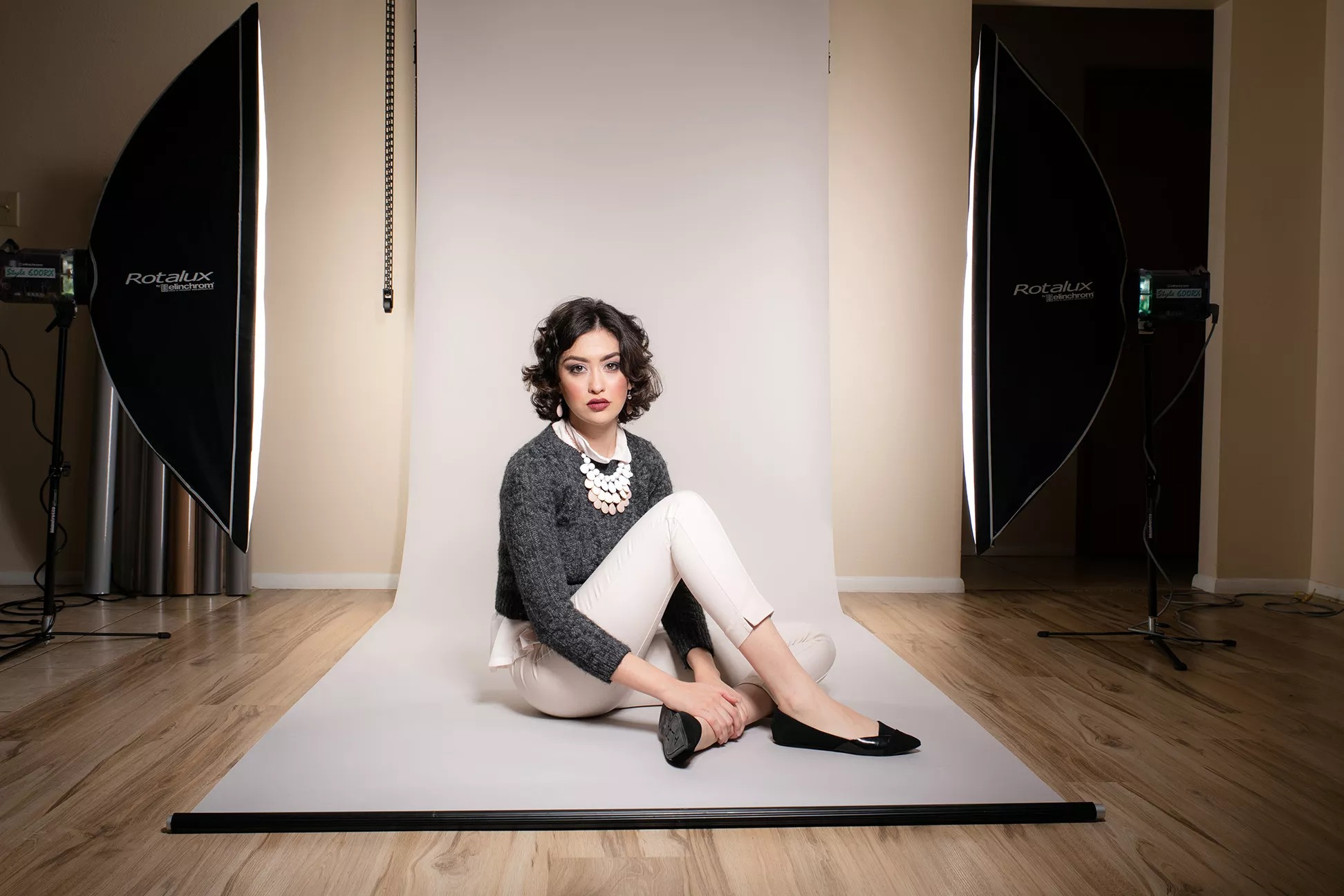
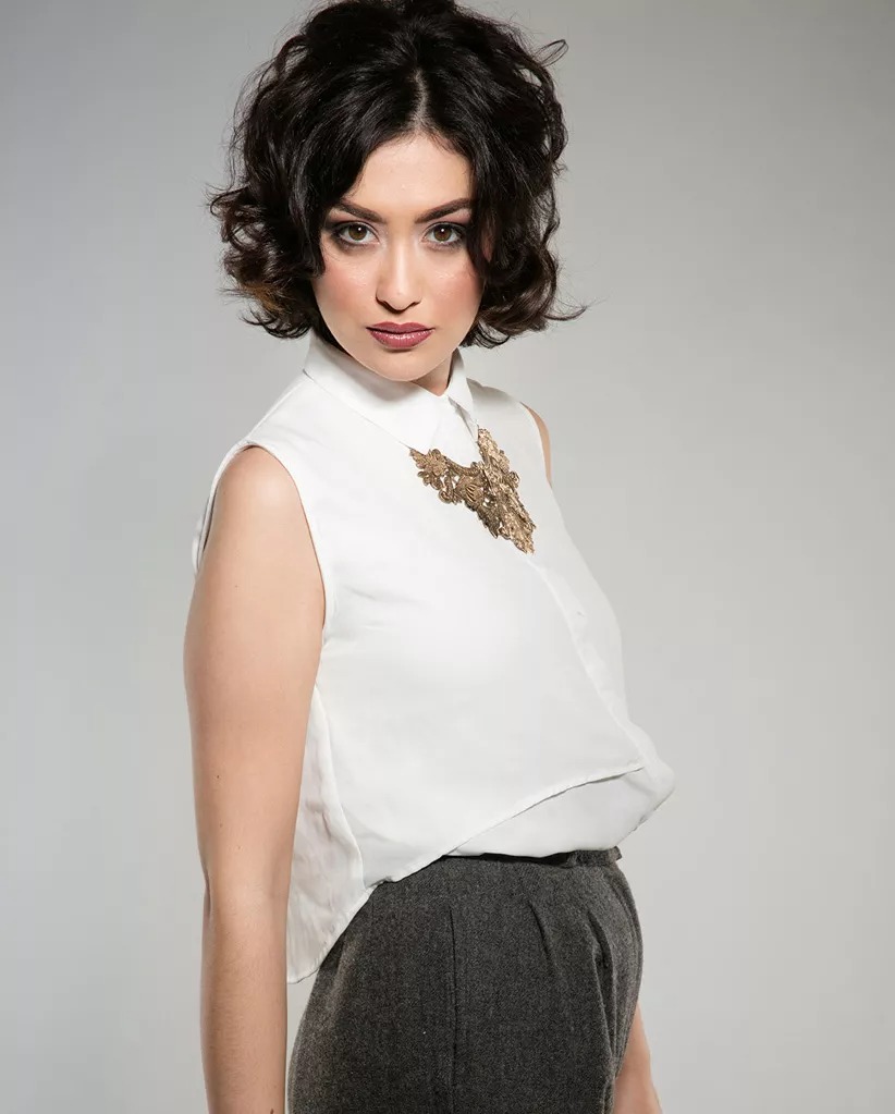
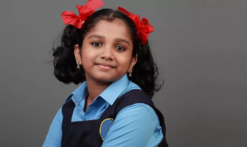
Complementing Skin Tones with Warm or Cool Gray Backgrounds
Principles of color temperature can also be applied to skin tones. Ask any makeup artist or clothing stylist and they will assure you this concept is fundamental to their craft.
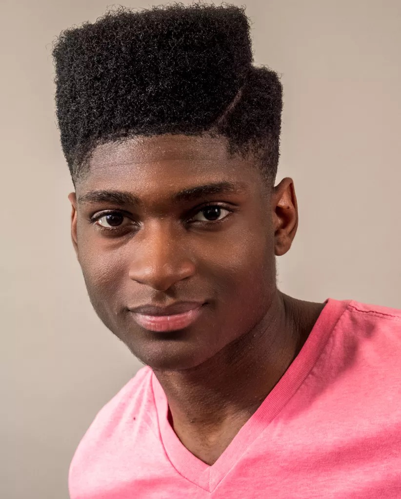
Warm complexions have yellow, peachy or golden undertones.
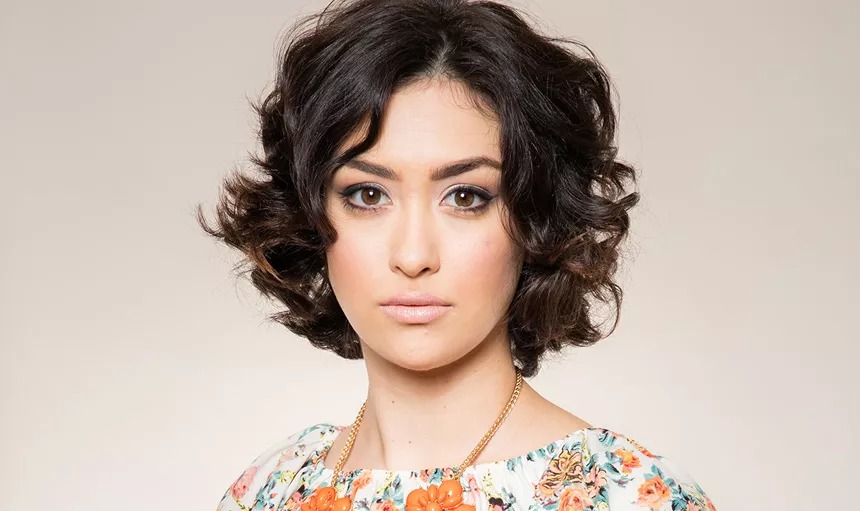
Cool complexions have pink, reddish or blue undertones.
Neutral skin tones have a greenish/olive undertone, or a combination of warm and cool undertones.
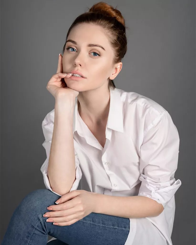
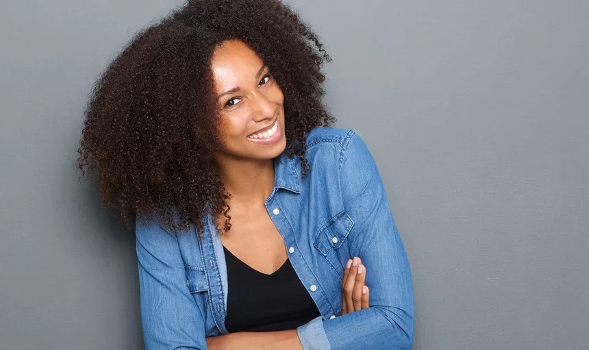
A very golden complexion can look sallow or even sickly against a cool, bluish, contrasting background. Conversely, that same warm complexion will look much healthier and more natural on a background with a peachier hue. Similarly, very fair complexions with bluish undertones look best on cool backgrounds as warm backgrounds tend to be less flattering, sometimes causing the subject to appear too pale. By familiarizing yourself with the variations in skin tone, you can more easily select the Savage Seamless Paper colors that will best flatter your subject.


Tip: By controlling how much light does or does not fall on your backdrop, you can achieve brighter or deeper tones of gray with any of our gray paper colors.
Flatter your subject’s beautiful skin by choosing a background that complements their complexion rather than contrasting it. The subtlety of warm and cool grays can really add elegance and sophistication to your portraits.