


Choosing Cohesive Colors in Graphic Design
March 24, 2021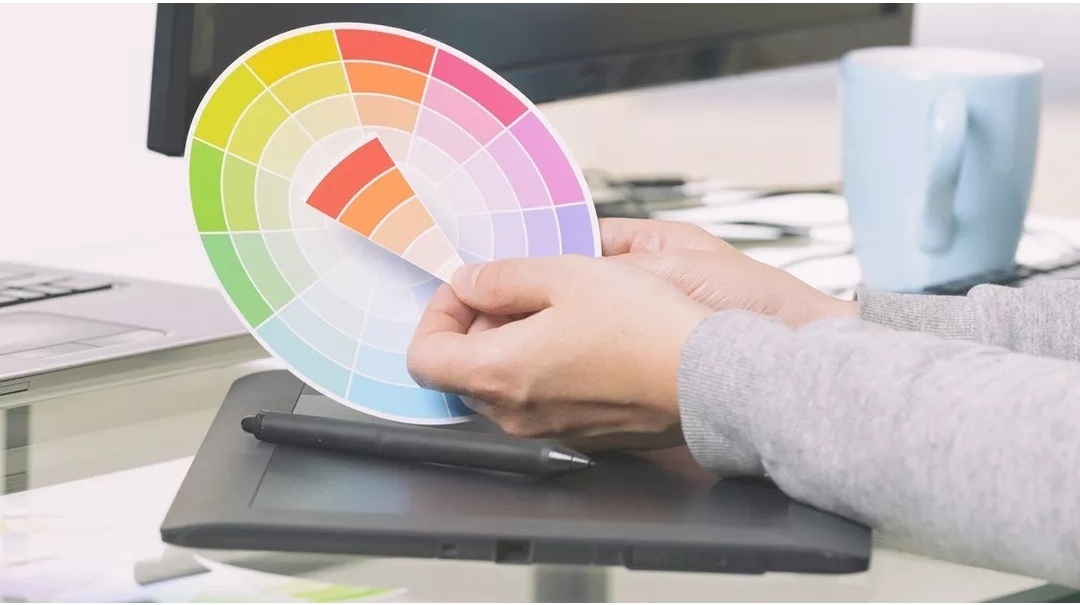
The beauty of is that it eliminates clutter and distractions, focuses the viewer’s attention on the subject, and is consistent in color from one photo shoot to the next. Did you know that Savage paper is a perfect palette for adding color in graphic design elements to your images?
What is Graphic Design?
A graphic is a shape, image or visual representation of an object. Graphics are often combined with text– numbers, letters, and punctuation, versus shapes and symbols. Graphic design entails intentional combined use of text and graphics, along with colors, textures, patterns, images, and other creative elements (such as motion in video) to craft a cohesive style and message. Graphic design elements can communicate volumes of information more effectively to a viewer than words or images can individually.
Importance in Brand Advertising
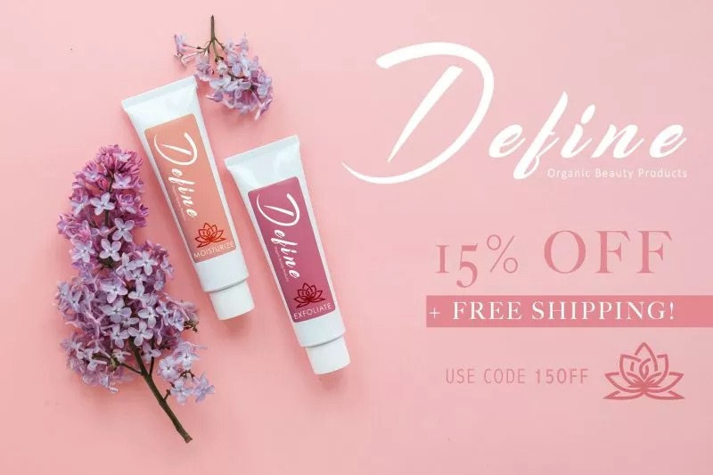
Graphic design logos, icons, and even just color combinations can become readily recognizable and associated with a brand. Well-crafted designs can instantly, and subliminally, imply aspects of quality, style, energy, values, genres and mood in ways that words often cannot. Think Nike®, FedEx® or CocaCola®. Color coordinated text and graphics combined with photos can have an enormous marketing influence on a viewer, greatly enhancing the story told by an image. This is well-known by big-brand advertisers who often employ color science and demographic research to determine which specific colors are most effective to use – particularly on product packaging and ad design.
Think of some of your favorite companies and brands. What shapes and colors come to mind when you think of internet providers, computer manufacturers, pet products, healthcare, etc.?

Complementary color scheme
Analogous color scheme

Monochrome color scheme
Great news! You don’t need to be a color scientist to put graphics and effective color design concepts to use in your photography. Even when used to simply color coordinate your artist signature or watermark with your image, your style can stand out above your competition.
Selecting the “Right” Colors
A quick and easy place to start is by using software such as Adobe Photoshop™ to sample and coordinate with an image photographed on Savage Seamless Background Paper. By sampling directly from an image and following a few key steps, you can be sure your graphics will work effectively in your photo. Whether you want to use a bold contrasting color that will really stand out to the viewer, or want multiple shades of the same hue to create subtle harmony – these steps will start you in the right direction.
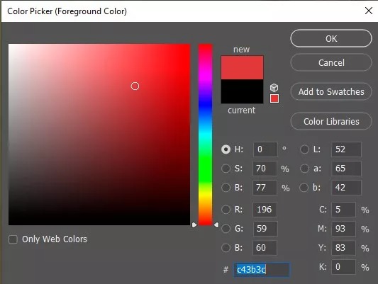
1. In Photoshop, use the eyedropper tool with a sample size of at least 5×5, and take a sample of a color you want to coordinate with in your image. This will change the foreground color in the tool panel to the color you sampled.
2. Then, to more precisely identify colors that work well with your sample:
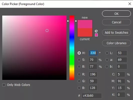
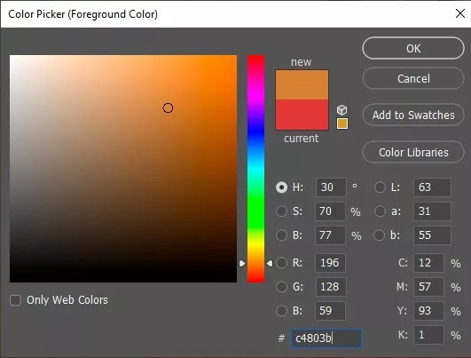
Double-click on the foreground thumbnail in the tool panel to open the Color Picker tool.
Make note of the color’s H, S, and B numeric values. These values represent the current color’s Hue, Saturation, and Brightness.
Change color values using the H/S/B fields in the middle of the window. A preview swatch of the new color will appear near the top of the Color Picker window.
We can follow some simple steps to find colors that will work well with our selection. Below are some specific examples:

Contrast
You may have noticed the word “contrast” first in the image above. Opposites attract, as they say; and it’s true even for colors. To create a bold, eye-catching visual separation between your original color and your new color, try using “complement” of your hue. It is exactly opposite on the standard 360 degree color wheel.
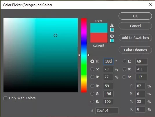
Complementary (opposite color): add or subtract 180
If the hue value of your selected color is between 0 and 180, add 180 to the numeric value in the “H” field to get the complementary (opposite) hue.
If the value is greater than 180, subtract 180 to get the complement.
NOTE that because hue values are organized in a continuous circle, 0 and 360 represent the same point on the circle. If you type 360 in the hue field, Photoshop will change it to 0.
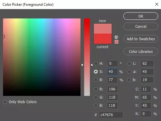
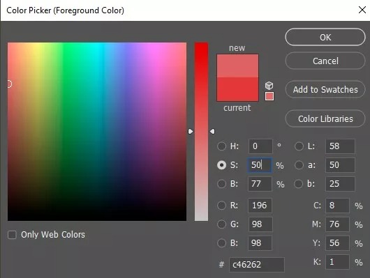
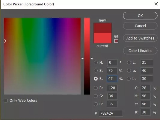
For example, let’s start with a sample from our model’s shirt in the image above – a Hue value of 0, Saturation 70 and Brightness 77.
The complementary (opposite) hue of value 0 is 180 – because 0+180=180 (and 36-180+180). Simple enough.
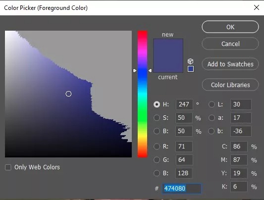
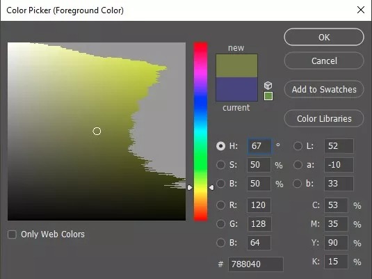
Let’s do that again starting with a different color: a nice purple – hue 247. Remember that for numbers higher than 180 we need to SUBTRACT to get the opposite.
BONUS TIP: Did you know that you can have Photoshop do the math for you? Just type the equation right into the field – “247-180” and tab to the next field. Photoshop will do the calculation!
When we do the math; we find that the direct complement of hue value 247 is 67, an olive green color.
(247-180=67)
Harmony
Variation in the shade/tint or brightness of a hue can lend a calm, harmonious level of energy to an image. To select colors that are the same hue, but different only in brightness or saturation; try the following:
Monochromatic (shades of a single hue): adjust saturation or brightness
Change only the Saturation (S) or Brightness (B) values by typing a new value in the numeric field or by sliding the arrows up or down on the saturation or brightness slider bars. Every value along the saturation slider or brightness slider will coordinate perfectly with your original color.
Creativity
To add variety while keeping matching close to the original, we can choose nearby colors in the same “family” of hues, versus opposites. A benefit of selecting similar or “analogous” colors is that they remain similar in (warm or cool) color temperature.
Analogous (similar colors): add or subtract 30
Try adding or subtracting 30 from the hue value or your original color. This will result in neighboring colors on the color wheel that will be noticeably different but will still naturally work well with the starting color.
Reminder; our starting hue is 0/360. When we add or subtract for analogous shades from that point on the color wheel we get 30 and 330.
Applying your selection:
Click “Add to Swatches” to give your selection a name and save it to your Swatches panel. (So you can quickly and easily reselect the same color in the future by clicking on the swatch you created in your Swatches panel.)
Click “OK” to set the desired color as your foreground color.
Use the Text tool to add words, adjusting the font, size and location. Remember to use the Swatches panel to easily switch between custom colors you’ve saved.
Don’t forget to consider using shapes, image borders and other elements to enhance your image!
More Resources
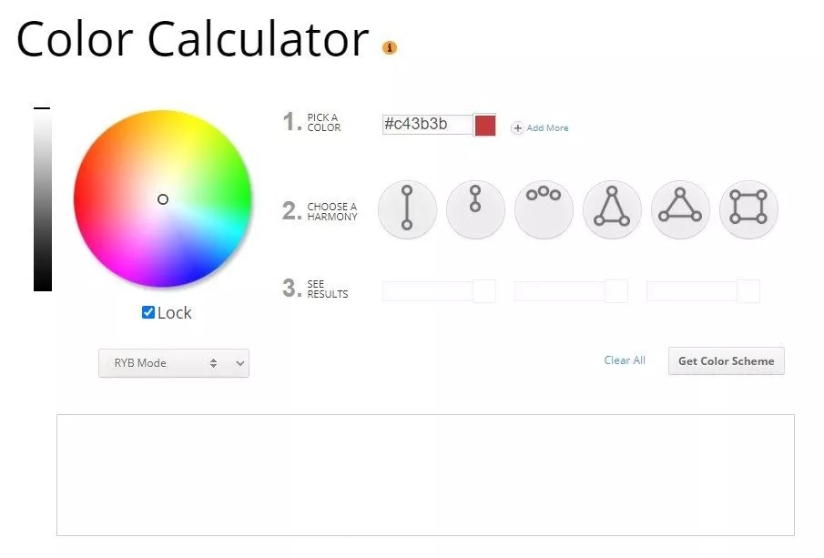
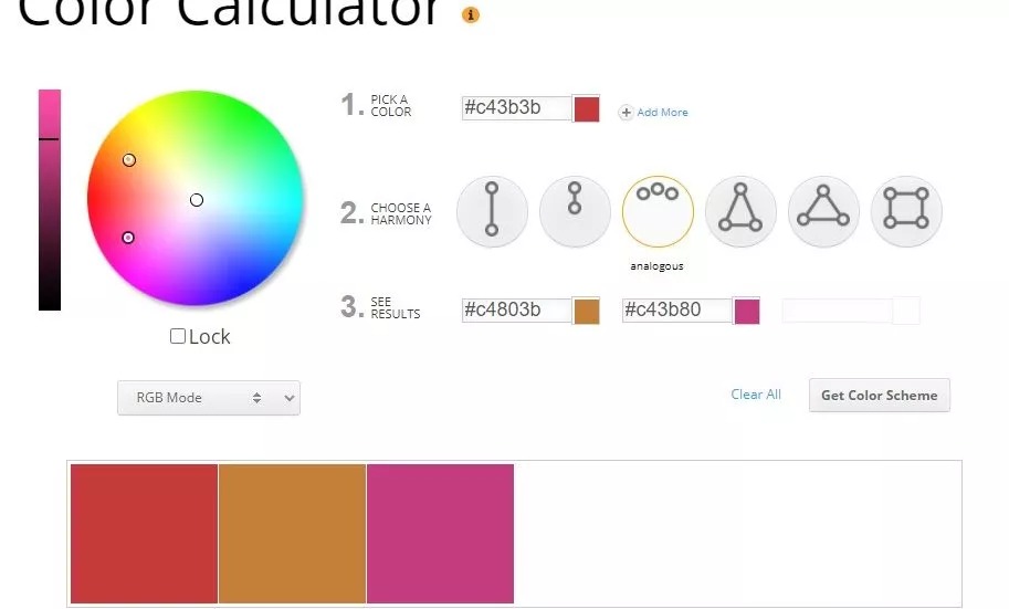
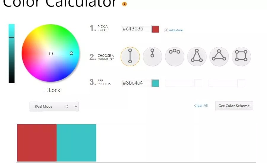
Search online with the phrase “color calculator” to find several tools where you can experiment with scientifically based color combinations.
Color values found on other sites can be sampled or typed directly into the Photoshop Color Picker window, or into an online tool like the Sessions College Color Calculator.
Exploring more color options
There are also many fascinating, in-depth articles available online which explore color science in great detail. To dive deep into why certain hues, tints, shades, and saturations work best together and why colors have such a profound influence on us; try searching “Color theory”, “The science of color”, “How colors influence us”, and similar phrases.
With new techniques and a new understanding of color theory, you’ll be well on your way to creating more impactful images for your portfolio and for your clients.
Happy creating!